KorGE Tutorial - Writing 2048 game. Step 1 - Views
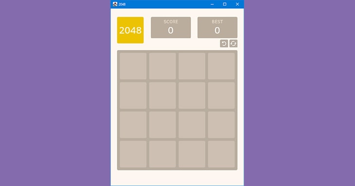
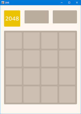
In the previous step we have created and configured a KorGE project for our game. In this step, we'll discuss KorGE's views and their positioning. We will also fill our stage with static elements using views, such as Graphics, Container, RoundRect, Text and Image. At the end of this step we will have the following result:
So let's start!
Views and containers
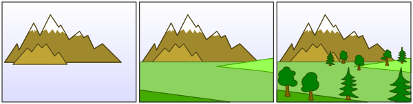
View structure in KorGE is based on two types of elements: views and containers. A container is a view that can have other views as children. During rendering, KorGE goes through the elements of the root container (the game scene) and draws them in the order they've been added to the view structure. The element added first will be covered by the other element added after it and overlapping it:
Each view has a size (width and height) and a position (x and y). Width and height determine the size of the rectangle bounding this view, x and y determine its position inside the parent container.
Main sizes
Before discussing various views, we should define a few main sizes. In the game, we'll have many square blocks (cells) with the same width/height. I suggest you use the cell size as the base size, it will simplify the determining other view sizes. The simplest way of calculating the most suitable size for a cell is by reducing the size of the scene by an integer number of times. Since we need 4 cells and small indents between them to fit on the screen, we can divide the size of the scene by 5 (we get the scene width via views.virtualWidth, read more here):
val cellSize = views.virtualWidth / 5.0
Let's define cell indents equal to 10 px. Now we can calculate the size of the whole field and the indent from the left edge of the screen:
val fieldSize = 50 + 4 * cellSize
val leftIndent = (views.virtualWidth - fieldSize) / 2
The last size value we need to specify is the indent from the top edge of the screen. Just set it to 150.0 (the value was determined experimentally):
val topIndent = 150.0
Now we can take a look at some KorGE views and use them.
RoundRect
Some of the most common views in KorGE are Graphics and its derived elements (like RoundRect and Circle). We'll take a look at Graphics later. Now, to understand the concept of creating korge views, we start with a simpler view - RoundRect.
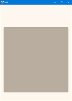
Let's try to draw our first dark rectangle that is the background of the game field. We create a new RoundRect object and specify its width and height, rounding radius and color. Then we specify its position via x and y:
val bgField = RoundRect(fieldSize, fieldSize, 5.0, fill = Colors["#b9aea0"])
bgField.x = leftIndent
bgField.y = topIndent
Let's run the runJvm task in terminal or via green play button (as I wrote in the previous step). And what do we see?
Nothing! There's no rectangle on the screen. But why?We forgot to add bgField to the root container! Let's fix it and restart the game.
val bgField = RoundRect(fieldSize, fieldSize, 5.0, fill = Colors["#b9aea0"])
bgField.x = leftIndent
bgField.y = topIndent
addChild(bgField)
//or alternatively
//bgField.addTo(this)
Yeah! It works! But what if we use tens or hundreds of view in our game? Do we need to add all of them to the root container manually and maybe repeat this mistake many times? No!
View DSL
KorGE provides a convenient way of working with a structured view tree. It uses inline and extension functions of Kotlin to create a special View DSL. Let's rewrite the creation of bgField using it:
val bgField = roundRect(fieldSize, fieldSize, 5.0, fill = Colors["#b9aea0"]) {
    x = leftIndent
    y = topIndent
}
Do you see the difference? Instead of constructor RoundRect(…) we use a special function **roundRect(…) {…}**that has the same signature, but it adds the view to the container by itself. We also provide a code block (in the curly braces) as the last parameter and specify the coordinates in it (using this.x instead of bgField.x). We still assign the roundRect object to the variable bgField because we'll need this object later.
We can also simplify this code a bit by using a special function - position(x, y):
val bgField = roundRect(fieldSize, fieldSize, 5.0, fill = Colors["#b9aea0"]) {
    position(leftIndent, topIndent)
}
Now we have simpler and easier-to-read code that does the same (you can rerun the game and make sure). From now on we will use only View DSL to build the view tree because it's the recommended approach.
Graphics
Graphics allows you to draw lines, shapes and complex contours. It has several methods for that, but we'll only take a look at a few of them.
The Graphics object has its own DSL. The main functions are fill, stroke and fillStroke. There are also extension functions like rect, rectHole, roundRect, arc, circle and ellipse.
Here we create the first cell background using some of them:
graphics {
    it.position(leftIndent, topIndent)
    fill(Colors["#cec0b2"]) {
        roundRect(10.0, 10.0, cellSize, cellSize, 5.0)
    }
}
Here we position our Graphics object, specify the color via fillfunction and draw a rounded rectangle with it. We specify the rectangle position relative to its Graphics container, not the root container! We also specify its size and rounding radius.
Let's look at the result:
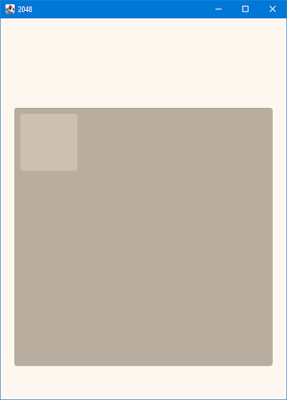
It worked!
Now we need to draw other 15 cells. Do you want to draw them in sequence? Let's do it easier and take advantage of two for cycles:
graphics {
    it.position(leftIndent, topIndent)
    fill(Colors["#cec0b2"]) {
        for (i in 0..3) {
            for (j in 0..3) {
                roundRect(10 + (10 + cellSize) * i, 10 + (10 + cellSize) * j, cellSize, cellSize, 5.0)
            }
        }
    }
}
So let's look at the result:
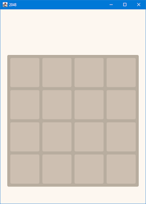
Well done!
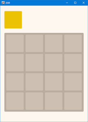
Next we add elements at the top: the game logo and two blocks for the current score and the best score (we will change their values later).
First, let's define the logo background. You should already understand this code:
val bgLogo = roundRect(cellSize, cellSize, 5.0, fill = Colors["#edc403"]) {
	position(leftIndent, 30.0)
}
We can add score blocks the same way. We'll make them a little wider and a little shorter than the cells. But then we'll need to calculate their coordinates manually and that's a lot of unnecessary code… We can do that easier!
Relative positioning
KorGE provides a convenient way of specifying a position of a view relative to other views. There are extension functions like alignRightToLeftOf, alignTopToBottomOf, centerBetweenand centerOn. Let's use some of them to create and position score blocks:
val bgBest = roundRect(cellSize * 1.5, cellSize * 0.8, 5.0, fill = Colors["#bbae9e"]) {
	alignRightToRightOf(bgField)
	alignTopToTopOf(bgLogo)
}
val bgScore = roundRect(cellSize * 1.5, cellSize * 0.8, 5.0, fill = Colors["#bbae9e"]) {
	alignRightToLeftOf(bgBest, 24)
	alignTopToTopOf(bgBest)
}

The next part of this step – text elements.
Text
KorGE has a simple view for displaying text - text. But we also need a font for it. I've decided to use Clear Sans bitmap font. You can find the needed files (clear_sans.fnt and clear_sans.png) in my repository on GitHub. You should add these files to your resources folder in commonMain. Then we need to import the font before using it (I prefer to do it at the beginning of the main function):
val font = resourcesVfs["clear_sans.fnt"].readBitmapFont()
Now we can add a text view for our logo. We specify a text string, a text size, a text color and a font. We use centerOnfunction to center it on our logo background:
text("2048", cellSize * 0.5, Colors.WHITE, font).centerOn(bgLogo)
Next we can add text views for the current score and the best score the same way. We'll take advantage of
alignTopToTopOffunction and specify indent between two views as the second argument. We'll also specify text bounds
for score number views and align them, so they will be shown correctly with different numbers. But remember you have
to import the library for showing those rectangles! To do so add this line at the top of your file:
import com.soywiz.korma.geom.*
text("BEST", cellSize * 0.25, RGBA(239, 226, 210), font) {
	centerXOn(bgBest)
	alignTopToTopOf(bgBest, 5.0)
}
text("0", cellSize * 0.5, Colors.WHITE, font) {
	setTextBounds(Rectangle(0.0, 0.0, bgBest.width, cellSize - 24.0))
	alignment = TextAlignment.MIDDLE_CENTER
	alignTopToTopOf(bgBest, 12.0)
	centerXOn(bgBest)
}
text("SCORE", cellSize * 0.25, RGBA(239, 226, 210), font) {
	centerXOn(bgScore)
	alignTopToTopOf(bgScore, 5.0)
}
text("0", cellSize * 0.5, Colors.WHITE, font) {
	setTextBounds(Rectangle(0.0, 0.0, bgScore.width, cellSize - 24.0))
	alignment = TextAlignment.MIDDLE_CENTER
	centerXOn(bgScore)
	alignTopToTopOf(bgScore, 12.0)
}
So, there remains the last part of UI that we must implement in this step – buttons undo and restart. We'll implement them as simple rectangles with images over them.
Images
KorGE has a great support of images. But it's a topic for a separate article. In this tutorial we'll consider images only like simple views. First, you should prepare image files in your resources folder (you can find my files on GitHub). Then we need to import these images in the game:
val restartImg = resourcesVfs["restart.png"].readBitmap()
val undoImg = resourcesVfs["undo.png"].readBitmap()
Now let's create our buttons. Here we'll use **container {…}**block for each button and add a background and an image to it. It will help us specify onClick events in the next step. This way a user will be able to click on a whole container as a button.
val btnSize = cellSize * 0.3
val restartBlock = container {
	val background = roundRect(btnSize, btnSize, 5.0, fill = RGBA(185, 174, 160))
	image(restartImg) {
		size(btnSize * 0.8, btnSize * 0.8)
		centerOn(background)
	}
	alignTopToBottomOf(bgBest, 5)
	alignRightToRightOf(bgField)
}
val undoBlock = container {
	val background = roundRect(btnSize, btnSize, 5.0, fill = RGBA(185, 174, 160))
	image(undoImg) {
		size(btnSize * 0.6, btnSize * 0.6)
		centerOn(background)
	}
	alignTopToTopOf(restartBlock)
	alignRightToLeftOf(restartBlock, 5.0)
}
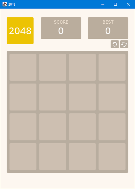
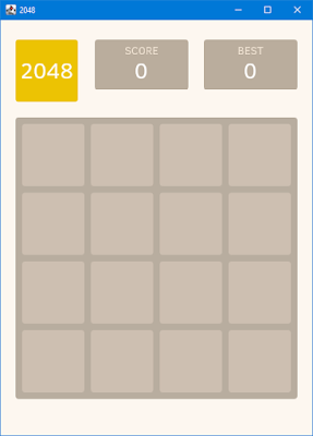
So we have the final result for this step:

The whole code written in this step is shown here. In the next step we'll add dynamic blocks and implement interaction with them. Stay tuned!